How "oldschool" graphics worked Part 1 - Commodore and Nintendo
The 8-Bit Guy4 HN recommenders · recommended in 3 months, 2015–2019
explainer · intro · evergreen · 2015–2019 on HN
The 8-Bit Guy explains the color limitations of 1980s computers and consoles such as the NES and Commodore 64. It shows how sprites, attributes and palettes shaped the look of old games.
Recommended as a clear, approachable explanation of how retro graphics hardware actually worked.
Up next
 11 mo on HN
Bret Victor The Future of Programming
Joey Reid
12 HN recommender · 2017–2026
 3 mo on HN
GDC 2010: Sid Meier Keynote - "Everything You Know is Wrong"
GameSpot
2 HN recommender · 2014–2019
 4 mo on HN
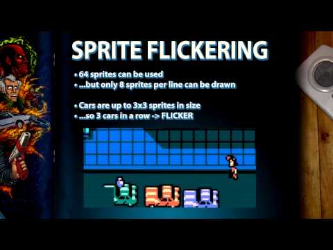
The Making of: ROM City Rampage (Retro City Rampage)
VblankEntertainment
4 HN recommender · 2014–2022
 4 mo on HN
Farbrausch - fr-041: debris. [HD]
kb
4 HN recommender · 2010–2026
 6 mo on HN
RiftSketch: Live coding in VR with the Oculus Rift, Firefox WebVR, JavaScript and Three.js
Brian Peiris
5 HN recommender · 2014–2020
 3 mo on HN
Farbrausch & Neuro - Masagin (HD Stereo)
Leonard Ritter
3 HN recommender · 2010–2023
 17 mo on HN
8 Bit & '8 Bitish' Graphics-Outside the Box
GDC Festival of Gaming
13 HN recommender · 2018–2026
 10 mo on HN
elevated by Rgba & TBC | 4k intro (FullHD 1080p demoscene demo)
Demoscene High-Quality Videos (Annikras)
7 HN recommender · 2013–2025
 10 mo on HN
The Ultimate Game Boy Talk (33c3)
media.ccc.de
10 HN recommender · 2017–2026
 9 mo on HN
A Mind Is Born (256 bytes)
lftkryo
8 HN recommender · 2017–2025
 10 mo on HN
CppCon 2016: Jason Turner “Rich Code for Tiny Computers: A Simple Commodore 64 Game in C++17”
CppCon
13 HN recommender · 2016–2024
 7 mo on HN
Compiling C to printable x86, to make an executable research paper
suckerpinch
8 HN recommender · 2018–2023
5 comments from Hacker News
This is a nice companion to ▶ this video which deals with more technical details of the implementation of NES and C64 graphics. This document reads like requirements to that video's design.
I believe that this is the same techniques that were covered in the excelent series "How oldschool graphics worked"[1] [1] ▶ this video
You would like this: "How 'oldschool' graphics worked Part 1 - Commodore and Nintendo" ▶ this video
The 8-Bit Guy has some great videos about how graphics worked on the older systems (including C=64): ▶ this video
Yeah, this illustration is what can be done in PPT in 5 minutes to explain how adding more layers/data can filter noise from signal, when I don't think it will take 5 minutes for me to write a LaTEX code that does the same. That's not counting Powerpoint does allow me to draw lines and stuff easily on a canvas. If I want to do it in LaTEX, I probably will need to draw that diagram on a separate program and import it back. link Sorry, the slide is clipped for some reason, but that's because I don't know how to configure OBS. It's not the best illustration ever, but you probably get the idea. Here is an animation that isn't mine and I think it's really well done to explain a hard idea (not necessarily in PPT): ▶ this video