The User is Drunk
squareweave4 HN recommenders · recommended in 3 months, 2014–2021
talk · general · evergreen · 2014–2021 on HN
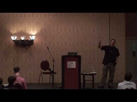
A short talk by Will Dayble of Squareweave arguing that you should design software as if the user were drunk: distracted, impaired in attention and vision, and prone to misreading. It is a user experience talk built around that framing.
HN users recommend it as a memorable, short way to build empathy for users' confusing mistakes and to design for distraction.
Up next
 3 mo on HN
Growing Human Neurons on a Home Made Electrode Array
The Thought Emporium
3 HN recommender · 2020–2025
 7 mo on HN
I Genetically Engineered *MYSELF* to Fix Lactose Intolerance
The Thought Emporium
8 HN recommender · 2018–2026
 11 mo on HN
Bret Victor - Inventing on Principle
Rui Oliveira
12 HN recommender · 2013–2025
 9 mo on HN
Mike Monteiro: F*ck You, Pay Me
CreativeMornings HQ
12 HN recommender · 2015–2026
 8 mo on HN
Music Software & Bad Interface Design: Avid’s Sibelius
Tantacrul
8 HN recommender · 2019–2026
 5 mo on HN
!!Con 2016 - How I Code and Use a Computer at 1,000 WPM!! By Sina Bahram
Confreaks
2 HN recommender · 2019–2022
 6 mo on HN
Notation Must Die: The Battle For How We Read Music
Tantacrul
6 HN recommender · 2023–2026
 6 mo on HN
A New Car UI: How touch screen controls in cars should work
Matthaeus Krenn
4 HN recommender · 2017–2023
 6 mo on HN
Bret Victor - The Humane Representation of Thought
Colin McDonnell
4 HN recommender · 2017–2025
 5 mo on HN
Mike Monteiro - "Fuck you pay me" (PT Br)
Montalvo Machado
6 HN recommender · 2013–2017
 5 mo on HN
Immediate-Mode Graphical User Interfaces - 2005
Casey Muratori
5 HN recommender · 2017–2024
 4 mo on HN
Dasher: information-efficient text entry
Google TechTalks
2 HN recommender · 2016–2025
4 comments from Hacker News
Somebody took "the user is drunk" UI design method quite literally :) Here is a video about the "the user is drunk" idea: ▶ this video Basically, the idea is about assuming that your user has an attention and a vision of a drunk person, not designing a UI for literally drunk people. I highly recommend the video.
I wouldn't be much surprised. The amount of things people do _not_ notice is staggering. When I do usability tests there's almost always something that doesn't get noticed although I thought it obvious and/or important. Personal anecdote: I managed to buy paper for my printer and only noticed upon arrival that it was the wrong size. The product photo looked right to be. I did not bother to check the details - or even the product title. ¯\_(ツ)_/¯ Also, regarding "if the person isn't drunk": There's a great short talk called "the user is drunk" which makes one much more sympathetic to such seemingly unexplainable comprehension fails that sometimes drive product designers mad: ▶ this video
"The User is Drunk" is explained better in video by Will Dayble of Squareweave: ▶ this video Also, OP's post seems more like "The UX Consultant is Drunk".
-Design quality is good, but you should re-evaluate that top image. Does a tar-covered hand say "High quality leather" to most people? Not to me, especially because I can't see the object. -Headline #1 should tell me what you're doing. Don't assume I know what your deal is about. You could almost switch the first and second. -CTA is way too far below the fold. I should immediately know what you want me to do. Donate? Subscribe? Drop it beneath "You are about to challange [sic] the status quo". -Challenge, not "challange". Might want to look over your page for spelling and grammar... This might be helpful: ▶ this video