violin plots should not exist
Angela Collier 2 HN recommenders · recommended in 2 months, 2023–2026
commentary · general · evergreen · 2023–2026 on HN
Physicist Angela Collier rants for 42 minutes about why violin plots are a poor way to show data, citing papers on violin and bean plots. It is part lecture on how to read distributions and part opinionated critique.
HN links it in data-visualization threads as an entertaining case against violin plots.
Up next
 4 mo on HN
Emacs For Writers
thoughtbot
3 HN recommender · 2016–2024
 6 mo on HN
I Tried To Make Something In America (The Smarter Scrubber Experiment) - Smarter Every Day 308
SmarterEveryDay
6 HN recommender · 2025–2026
 5 mo on HN
Why You Should Put YOUR MASK On First (My Brain Without Oxygen) - Smarter Every Day 157
SmarterEveryDay
5 HN recommender · 2016–2025
 14 mo on HN
A Better Default Colormap for Matplotlib | SciPy 2015 | Nathaniel Smith and Stéfan van der Walt
Enthought
15 HN recommender · 2015–2026
 12 mo on HN
Hans Rosling's 200 Countries, 200 Years, 4 Minutes - The Joy of Stats - BBC
BBC
10 HN recommender · 2010–2023
 11 mo on HN
DON'T PANIC — Hans Rosling showing the facts about population
Gapminder Foundation
8 HN recommender · 2017–2021
 8 mo on HN
Wealth Inequality in America
politizane
8 HN recommender · 2013–2025
 7 mo on HN
Animations of unseeable biology | Drew Berry | TED
TED
7 HN recommender · 2017–2025
 7 mo on HN
Immigration, World Poverty and Gumballs
NumbersUSA
7 HN recommender · 2013–2024
 6 mo on HN
How not to be ignorant about the world | Hans and Ola Rosling
TED
5 HN recommender · 2015–2023
 5 mo on HN
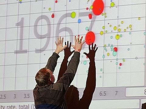
The best stats you've ever seen | Hans Rosling
TED
5 HN recommender · 2013–2026
 5 mo on HN
4 2 1 Christopher Domas The future of RE Dynamic Binary Visualization
Adrian Crenshaw
7 HN recommender · 2013–2026
4 comments from Hacker News
I disagree about violin plots being better. Here is a great rant (borderline lecture) from Angela Collier on why they aren’t [0] [0] ▶ this video
I have never liked violin plots,but I am very much not in the field of data visualisation. Just a week ago I stumbled on a video titled "violin plots should not exist" which made things fall into place: ▶ this video
I see violin plots on the front page. Just say no to violin plots. In almost any situation you either want to talk about the actual distribution (in which case plotting the distribution on one side of the line arranged horizontally is significantly superior to plotting it vertically on both sides of the line for some reason as a violin plot does) or you want to talk about the quartiles etc in which case a boxplot is better. A violin plot basically tries to do both and as a result does them both badly. Extended anti-violin plot rant here ▶ this video
> There are other distribution chart types that can be useful in specific situations, such as frequency polygons, violin plots, cumulative distribution plots, and bee swarm plots, but the three types that I described above are the easiest ones to grasp, and are able to communicate most of the insights that are needed for day-to-day decision-making in most organizations. (I’m not mentioning histograms here because they’re generally only useful for visualizing a single set of values, whereas box plots and their alternatives are for visualizing multiple sets of values, which is a different use case.) There's generalizations and 'specific situations' which the author considers worthy of some plots, and other specific situations that the author doesn't consider worthy of other plots. At best, don't use box plots if your distributions do not have a single mode and may likely be misinterpreted is my takeaway. Here's a rant against violin plots by my fave physicist ranter[0] (not Sabine), so maybe never use them. [0] ▶ this video